02 LANDING PAGE
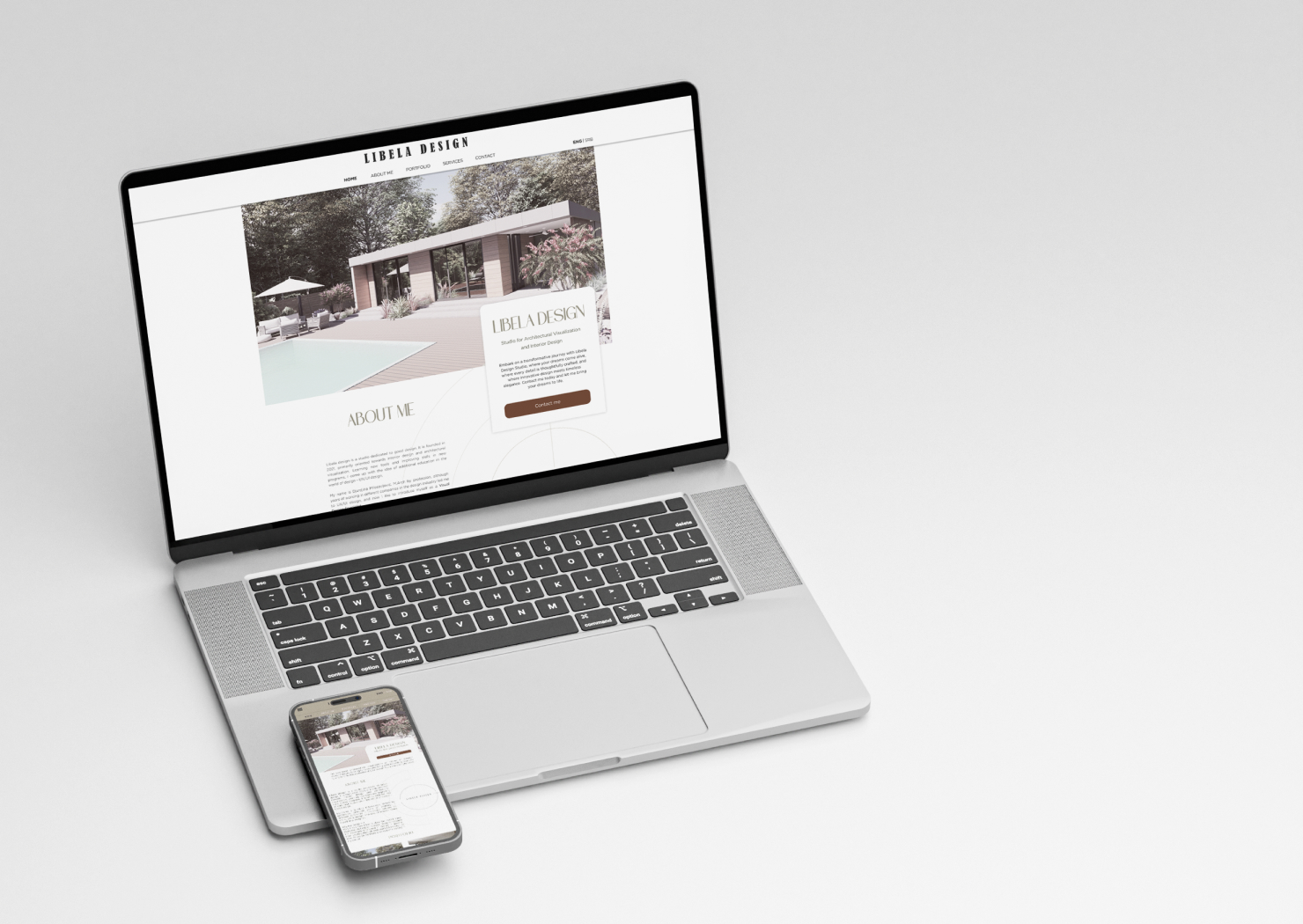
About the brand
Libela design is a studio dedicated to good design. It is founded in 2021, primarily oriented towards interior design and architectural visualization.
Passion for creating fine aesthetics and sophisticated designs led me to learning new tools and improving skills in new programs. The landing page is a result of years of practicing Visual Design, and challenging myself to master new tools and capabilities.
Through this showcase of personal esthetic choices and the ability to create a specific whole from more parts of designs, you have an opportunity to meet this small brand.

Color Palette
The brand is all reflected in nature, and uses natural materials and colors, as a reflection of my personality which is highly grounded in nature.
Earthy and pastel tones are where I feel most comfortable. Those reflect nature itself, stability, connectivity, efficiency, and authenticity.
Green and olive ones are chosen for the main ones here, so the users feel comfortable, peaceful, and enjoyable when visiting the landing page.
The brown color is the main color of the brand, and it can be found on the social network LIBELA DESIGN logo, so the buttons are emphasized in this color to reflect the brand.
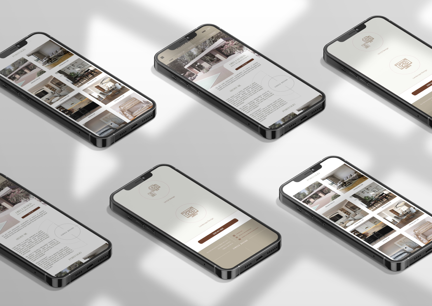
Typefaces
Choosing the right font for the brand was the most challenging part of the design. As a visual design brand with a deep connection to natural materials, authenticity, clean shapes and forms, and orientation toward the user's needs, it was the priority to elect the ones that reflect the brand values.
Authentically, grounded to earth and nature, and sophisticated among other values reflect best in Pinkerstone font. Pinkerstone is therefore used for the heading and most prominent parts.
Gotham is used for body text, to reflect the simplicity, clean shapes and forms, elegance, and sophisticated taste in design.


