01 REBRANDING

About the brand
Libela Design Studio is a studio dedicated to good design, where modernity meets sophistication and elegance. It was founded in 2021, primarily oriented toward interior design and architectural visualization.
After years of working in Visual and Graphic Design, and as I decided to fully prequalify myself last year in the field of Web and Product Design, Architectural Studio became Visual Design Studio. It now offers services such as Web Design, Product and UX/UI design, and also has a newbie coming this year, a small brand, named ГРИЗЛИ.
This journey started with a wish to have my landing page designed by myself, but as I fell in love on that path with Web, Product, and Visual Design, I now want to help other Architects and Interior Designers to have beautifully created Landing pages and Portfolio websites, showcasing their design in the best way.
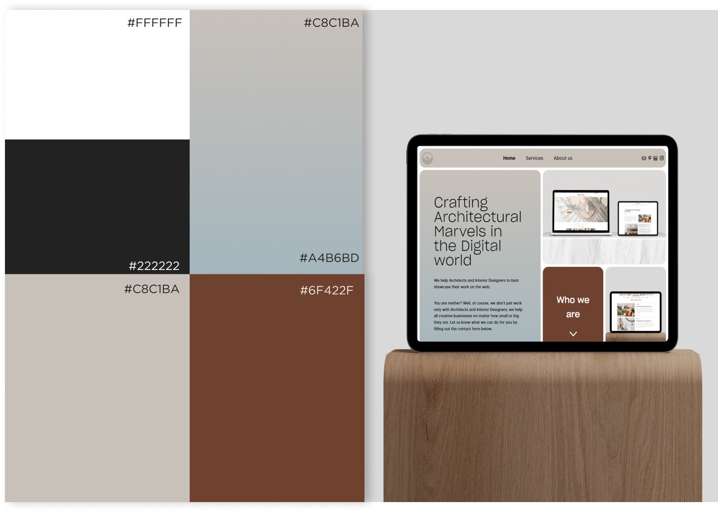
Color Palette
As the brand is reflected in nature, the color palette remains the same, with a few refreshments following trends and modernity.
Earthy tones and soothing neutrals are harmoniously blended, representing the belief in designing spaces that seamlessly integrate with their surroundings, fostering a sense of tranquility and connection.
Earthy tones serve as the foundation of the palette, embracing the warmth and grounding qualities found in nature. Rich shades of deep brown and warm neutrals create a sense of stability and balance, mirroring the solid foundation on which our designs are built.
Typefaces
Just as a libela (serbian) measures the balance of structures, Libela Design measures the delicate balance between design and functionality.
The redesigned logo represents a reflection of the measuring tool “libela”, which is used to measure the balance of structures. The upper part of the logo reflects a measured perfect balance, that’s why the name itself is centrified and aligned in the middle.
The other part represents the harmony that can be found in our surroundings in nature, and the balance that lies in there.


